

1898 Porter’s House
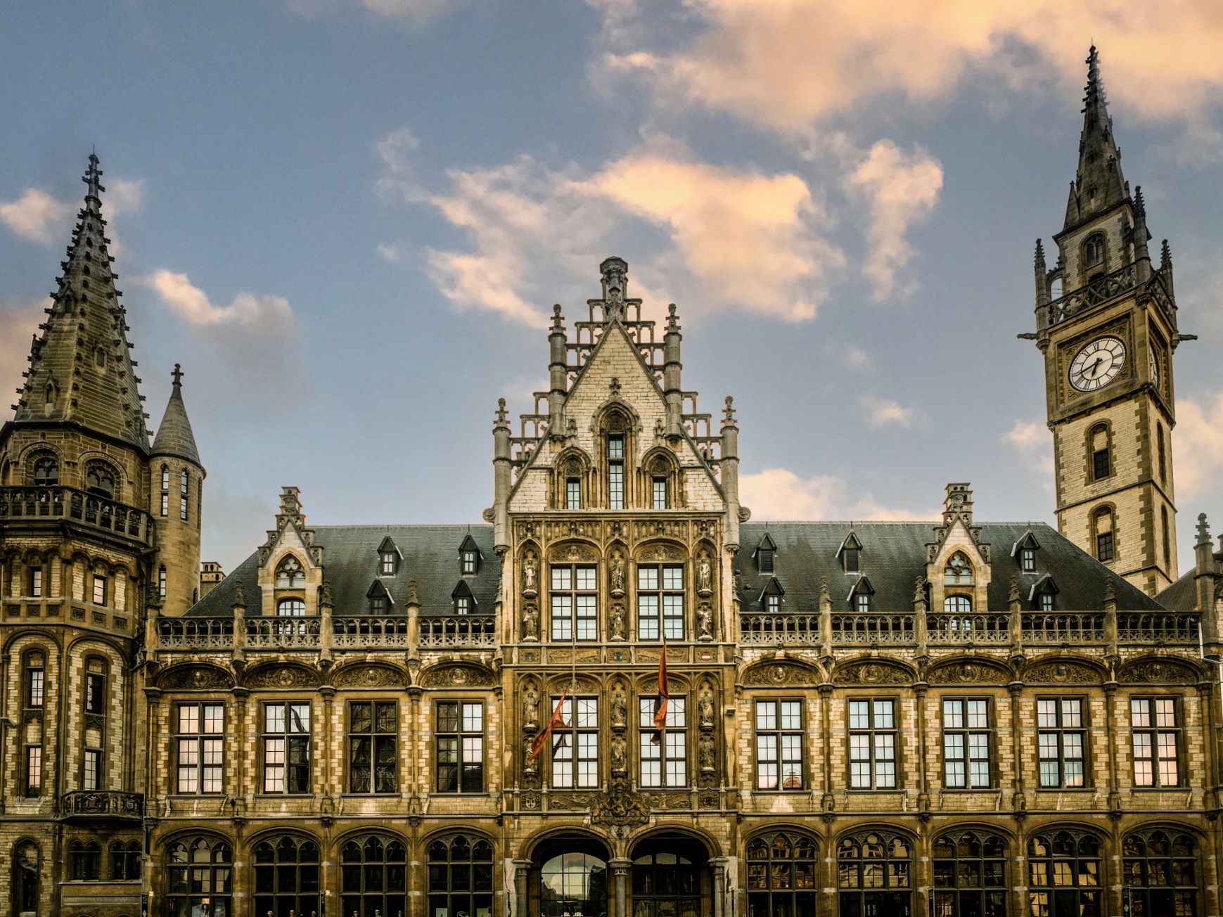
Set discreetly along Ghent’s historic canals, 1898 Porter’s house marks the quiet transformation of a once-modest service building into an intimate hotel shaped by place, memory, and atmosphere.
Following the acclaimed success of 1898 The Post, the neighbouring property, Geraldine Dohogne has been sought out once again to lead the interior design of this next chapter – an appointment that reflects the enduring resonance of her emotionally driven, materially honest approach to hospitality design.
The intimate scale of 1898 Porter’s house, containing just four rooms and suites, allows Geraldine Dohogne’s layered approach to fully unfold.
Spaces are proportioned with care, light is treated as a material in its own right, and transitions are gradual – echoing the building’s original role as a place of pause and welcome.
A refined yet expressive colour palette, anchored in reds and enriched with undertones of green, blue, and gold, brings depth and warmth without excess, creating interiors that feel immersive, sensual, and quietly sophisticated.
Rather than emulate the grandeur of large luxury hotels, 1898 Porter’s house continues Dohogne’s long-held belief that true luxury lies in emotion rather than display.
This is evident in so many parts 1898 Porter’s house.
It is highly individual and personal.
It has the look and feel of a cosy guesthouse; a million miles from the large scale, design continuity of most branded hotels.
Geraldine Dohogne is justifiably proud of her achievement here and has kindly taken the time to answer questions put to her by GS Magazine.
GS Magazine: You sourced some vintage furniture and artefacts from around Belgium. Did you find any ‘gems’?
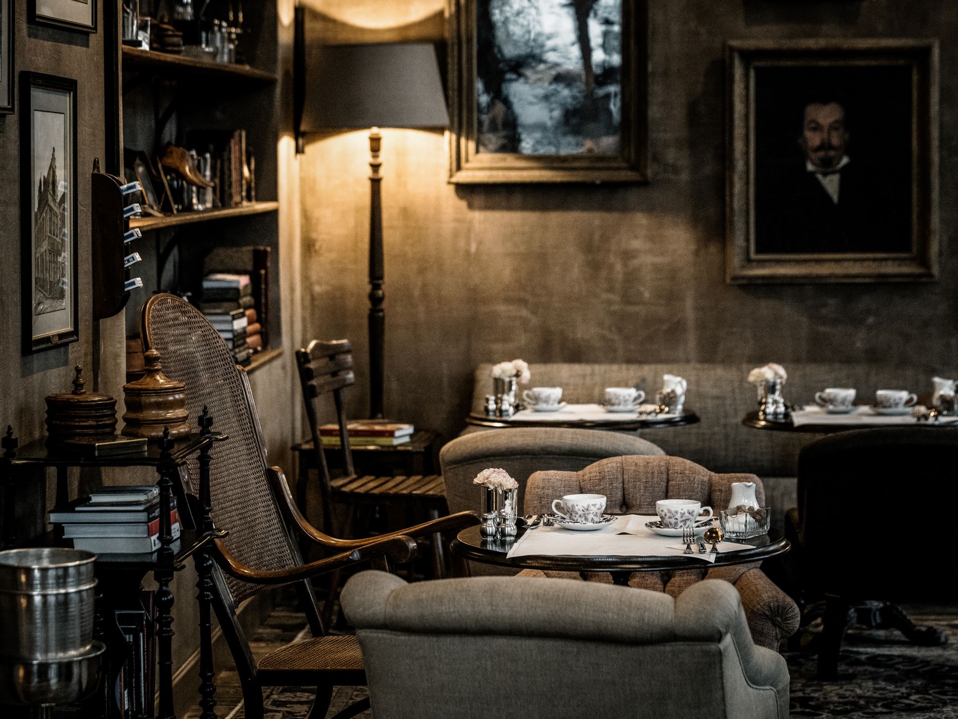
Geraldine Dohogne: Vintage sourcing is a very important part of our work because it brings something to an interior that you simply cannot recreate with new pieces.
It generates emotion and can trigger memories.
The patina of a piece, the marks left by use, the way a material has aged — all of these details express the passage of time and give a space a sense of history and soul.
It gives the feeling of a home that had evolved over time, rather than a hotel that had been designed all at once.
We chose furniture and objects with character, patina and a certain imperfection; small side tables and individual pieces that add character and make the rooms feel collected rather than simply designed.
Where we needed a greater level of comfort, armchairs, for example, we worked with local Belgian manufacturers who still produce everything in their own workshops.
This combination of vintage pieces and locally made furniture was very important to us.
But some of my favourite ‘gems’ are actually the things we discovered that tell the story of the building and of Ghent itself.
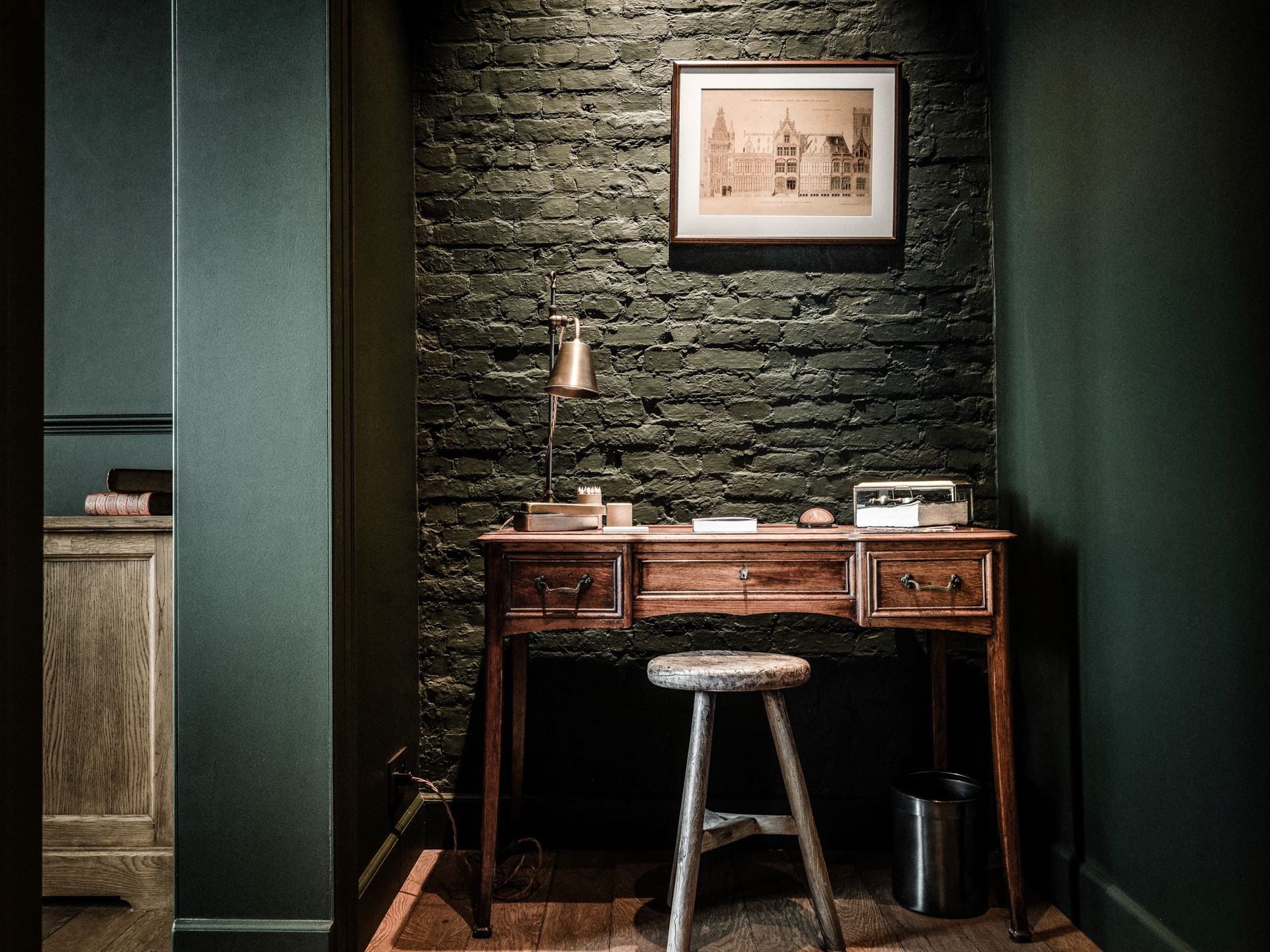
We found original old plans of the building, as well as vintage postcards of Ghent.
Some still have handwritten messages on the back.
These are no longer simply decorative objects; they are fragments of people’s lives and memories.
We also created a photo album at the entrance desk filled with historical images of Ghent, which guests can browse through. The city has naturally evolved, but so much remains recognisable, and I love the idea that a guest can look at an image from decades ago and then step outside and experience that same place today.
I also individually sourced old sketches and paintings depicting the Graslei and the former port directly in front of the building.
Together, these objects create small connections between the interiors, the building and the city beyond.
For me, those discoveries are the gems.
They bring something that cannot really be designed or reproduced: history, personality and a sense of having already lived.
It is about finding pieces with a story.
Things that create curiosity, emotion and perhaps even awaken a personal memory.
They give guests something to discover and help make their stay feel connected to a place that existed long before we arrived.
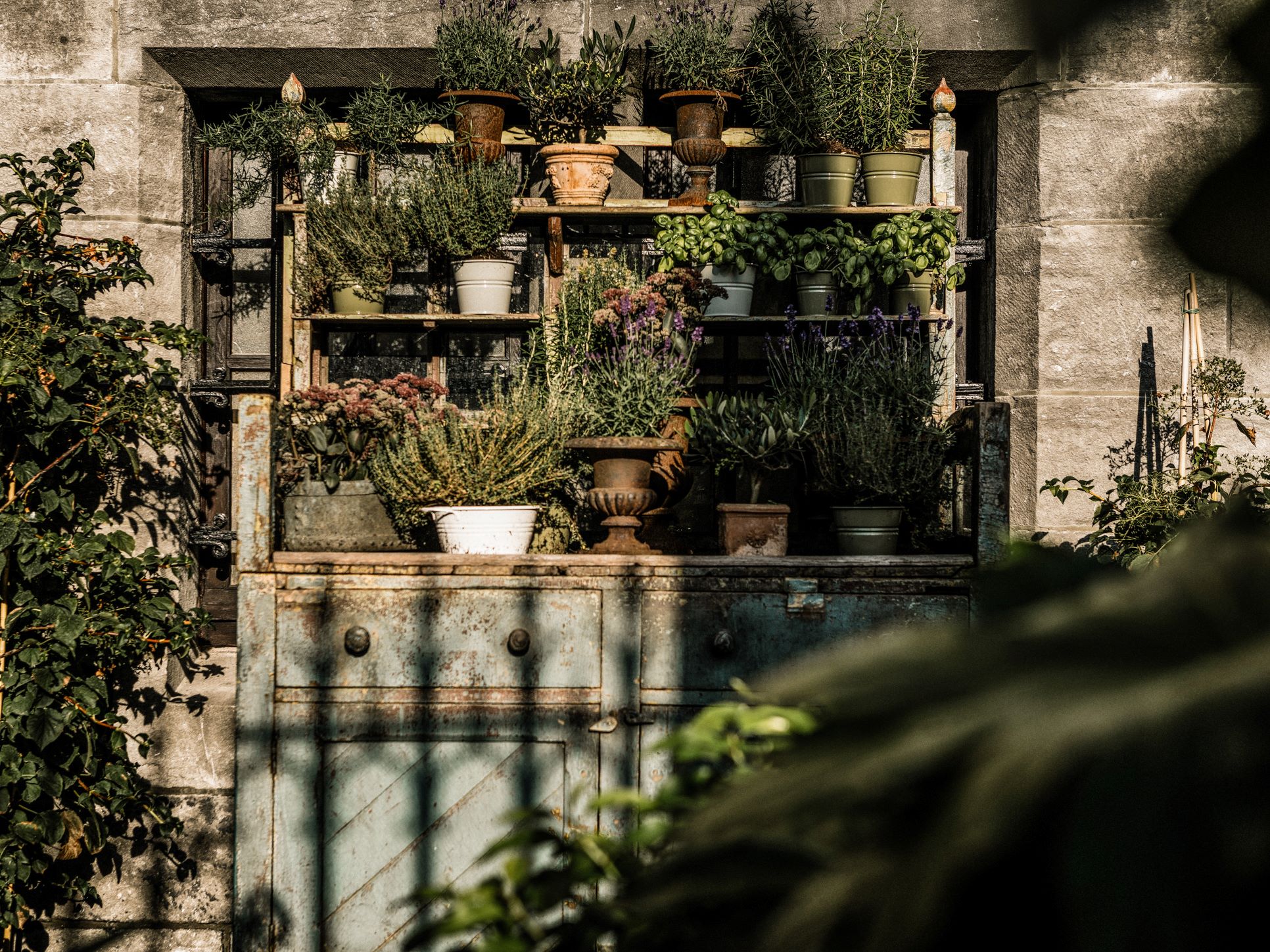
GS Magazine: What was the design brief?
Geraldine Dohogne: The brief was to transform the former Porter’s House, adjoining 1898 The Post, into an intimate luxury hospitality experience while respecting the history and architectural character of the building.
Porter’s House gave us an extraordinary story to work with.
It was originally the house of the guard of the Hôtel des Postes et Télégraphes, today 1898 The Post.
I wanted to retain something of that idea of the guardian and his home.
When guests first enter, there is a small desk with a guest book, old letters and objects that evoke the feeling of someone having occupied and looked after this place.
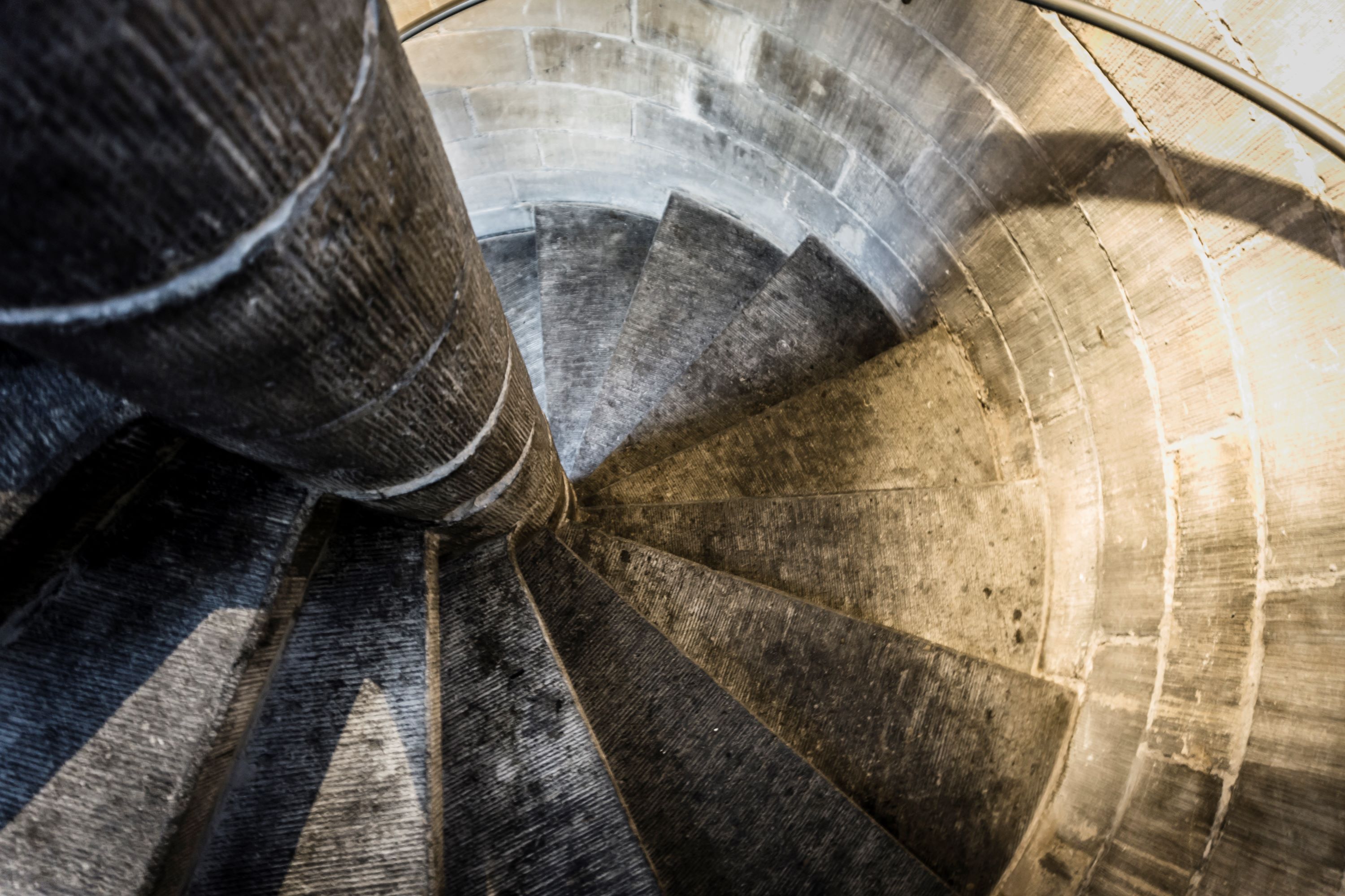
From there, you gradually move upwards through the house and discover the different rooms and spaces.
It feels much more like entering somebody’s private home than entering a conventional hotel.
The idea was to create somewhere deeply comfortable and residential, with rooms that have personality and a strong sense of place.
Its location was equally important.
The house looks directly onto the Graslei, historically Ghent’s port and closely connected to the grain trade.
That history influenced our material palette.
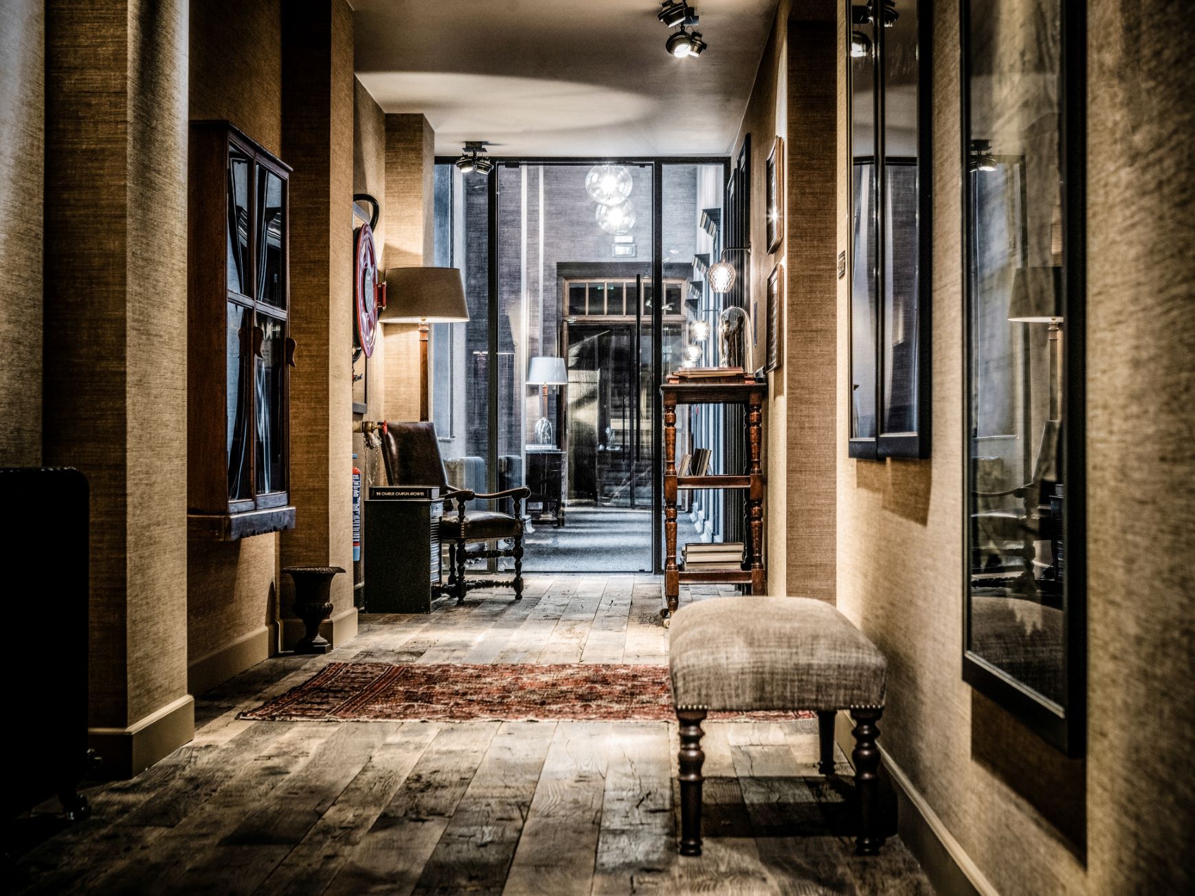
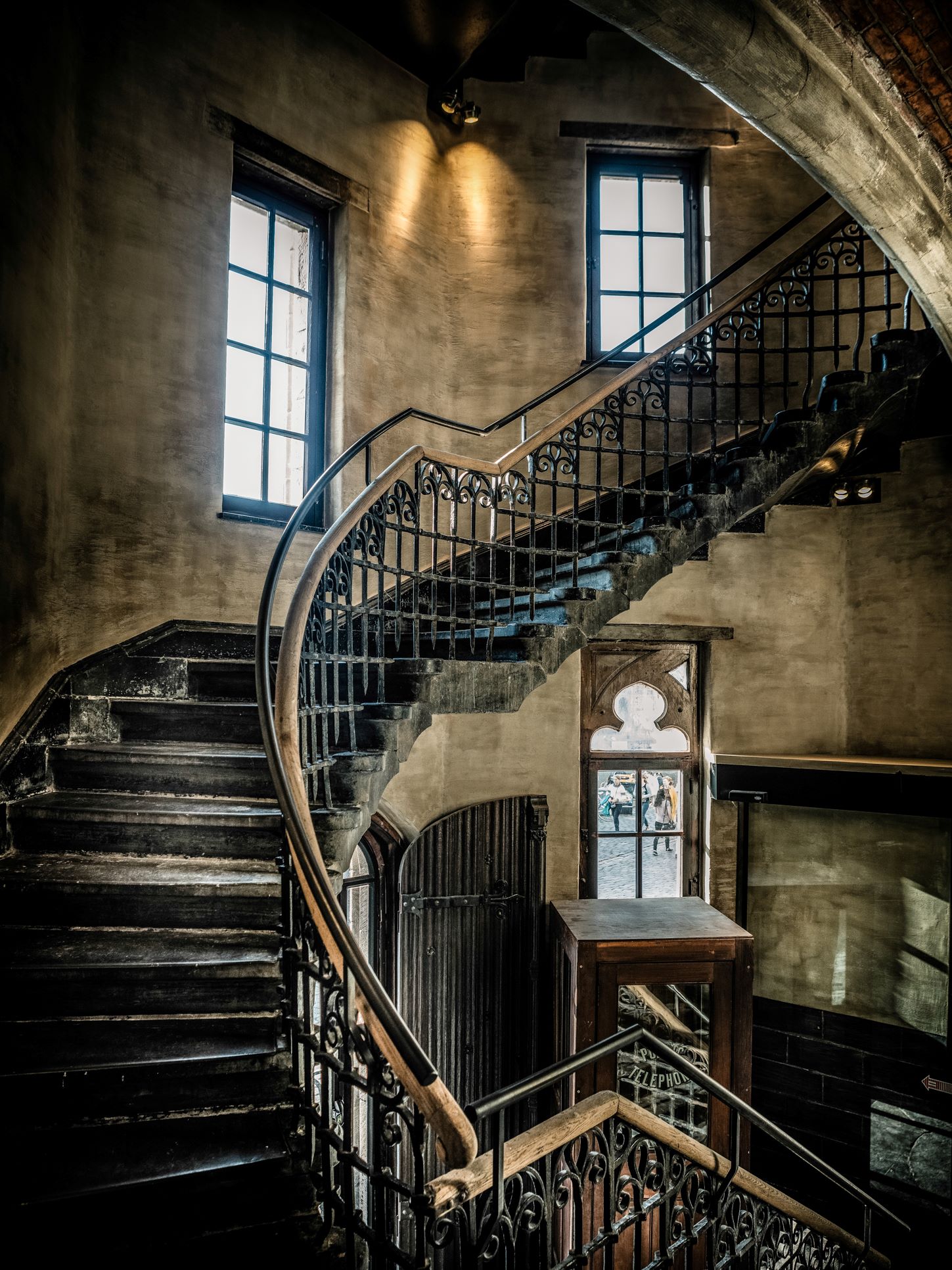
Wood and metal appear throughout the property, bringing a subtle industrial character that references the activity and materiality of the former port without becoming overly literal.
We also looked very closely at the architectural language already present in the house.
Existing details — the bevels, doors, façade and original architectural elements — became a vocabulary that we could reinterpret throughout the new interiors.
So the brief ultimately became about comfort, memory and place: creating a highly personal house that works effortlessly for today’s guest, while allowing the history of the guard, the building, the port and the city of Ghent to remain present in the experience.
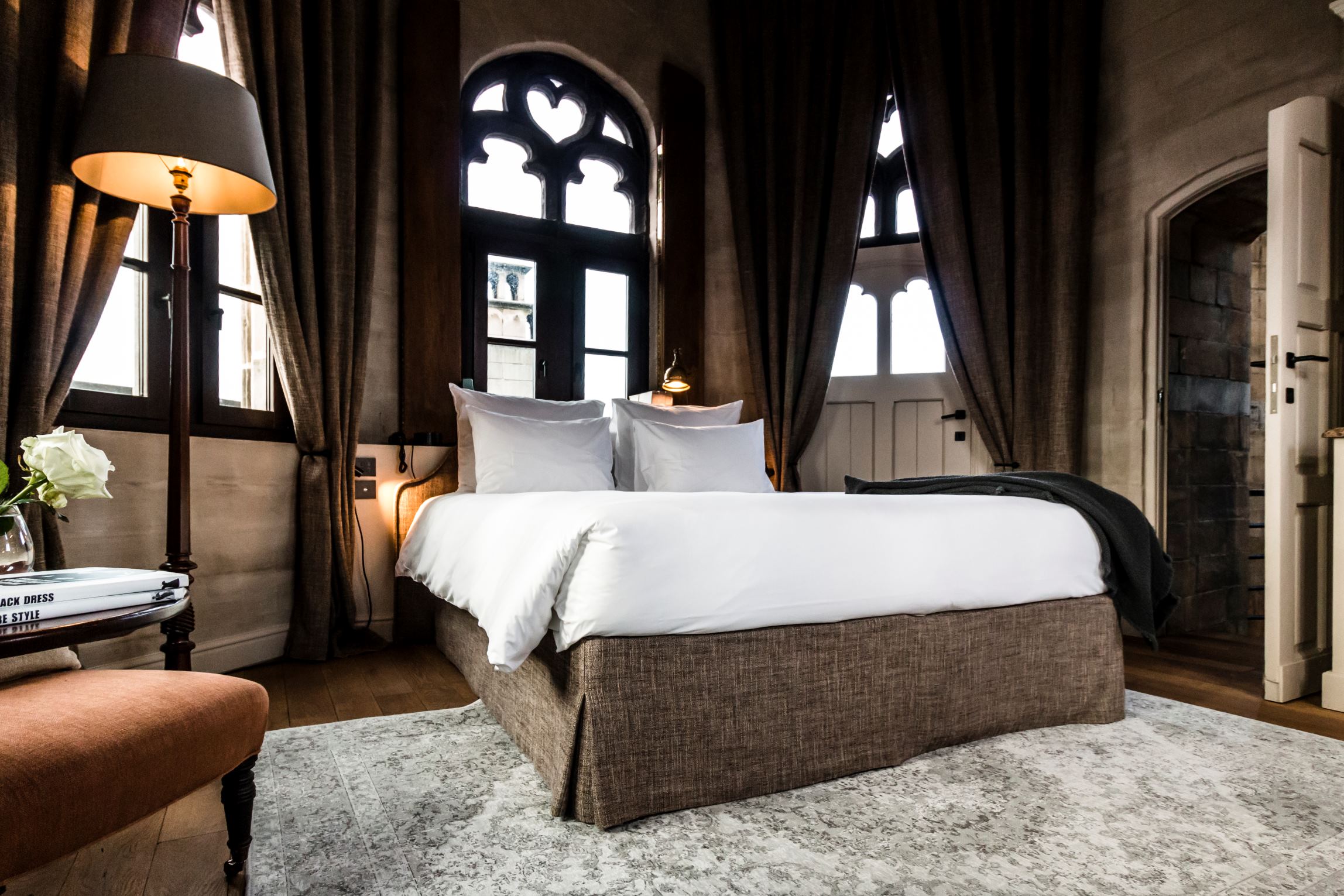
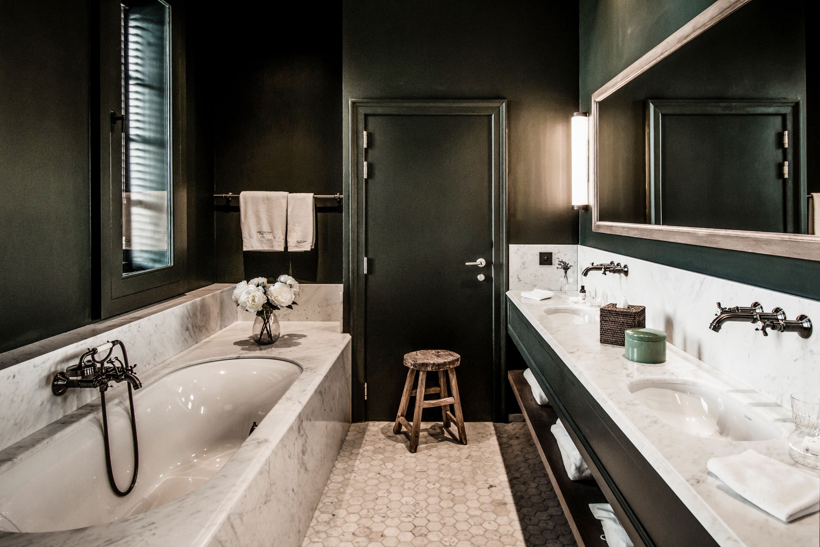
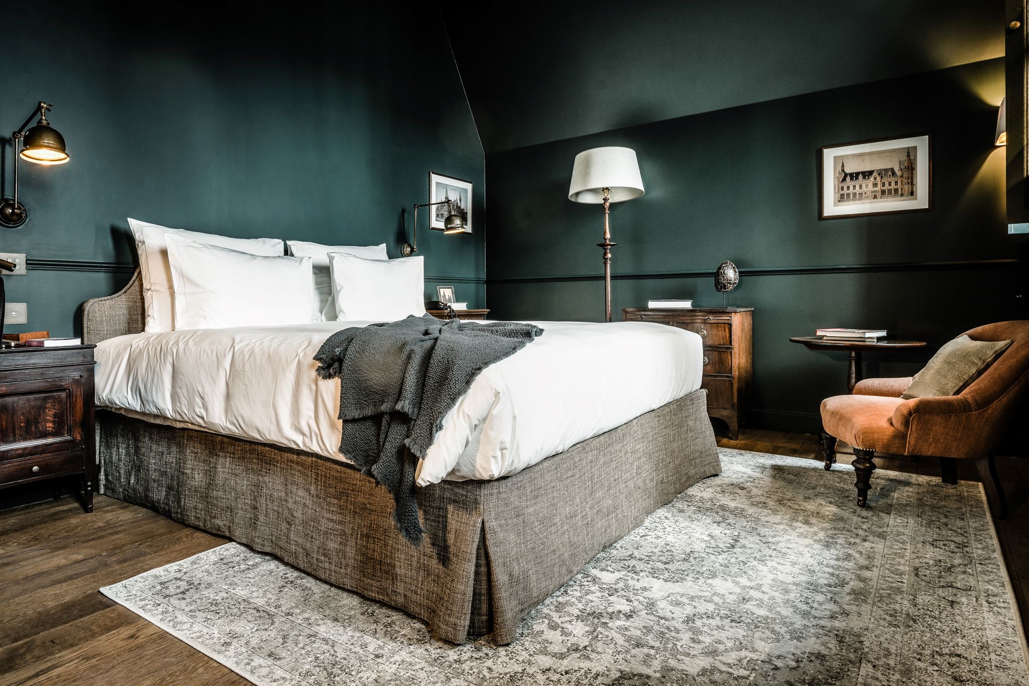
GS Magazine: The colour scheme is very unusual for hotel room interiors.
Geraldine Dohogne: Yes, deliberately so.
I didn’t want to fall into the traditional hotel palette of safe neutrals.
The colours were not chosen simply to be different — they came very naturally from our research into the building and its period.
The building dates from 1898, so we looked at the colours that would have been present at that time.
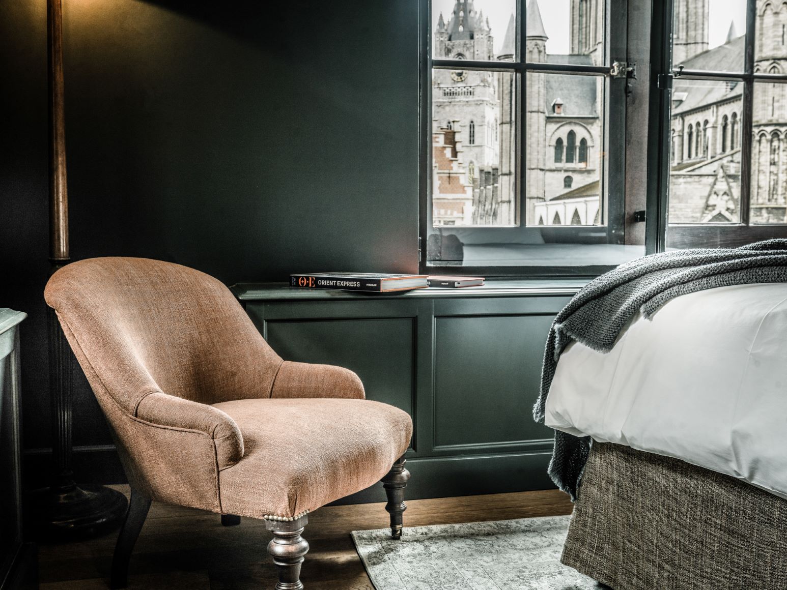
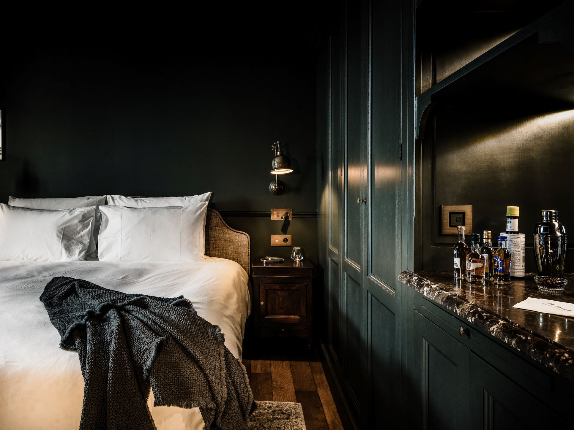
Deep greens, reds and bronze tones were all part of that vocabulary.
As with many elements of the project, the palette therefore has a reason for being there: it is connected to the history of the building and to what might have been used at the end of the 19th century, but reinterpreted in a contemporary way.
They are quite rich colours, but they have a muted, almost aged quality to them.
I also like working with strong, almost primary colours because they create a very good foundation for layering materials.
Against those deeper tones, we could introduce natural stone, timber, wool, linen, velvet and aged metals without the interior becoming too decorative.
Each material brings a different texture and depth, while the colour holds everything together.
The colours also change enormously depending on the light and the time of day.
They can feel quite vibrant in daylight and much more intimate and enveloping in the evening.
That was particularly important here because I wanted the rooms to have a sense of warmth and intimacy, to feel more like private rooms in a house than conventional hotel bedrooms.
The palette is another way of telling the story of Porter’s House.
The colours may initially feel unusual for a hotel, but within this particular building, they feel as though they belong.
GS Magazine: Did anything or anyone in particular influence, the design? For instance, the building itself?
Geraldine Dohogne: The building was absolutely the starting point.
As mentioned above, its history, not only when it was built, but how it was originally used and its relationship with the former Hôtel des Postes et Télégraphes, became the starting point for many of our decisions.
I am always interested in creating interiors that belong to their location, rather than bringing a predetermined aesthetic to a project.
At Porter’s House, we looked at the existing architecture, its history, proportions and original details and asked what felt natural within that context.
Working with honest, tactile materials were also very important.
Aged timber, natural stone, linen, wool, antiques and handcrafted pieces create a dialogue with the architecture.
The intention was never to create an obvious contrast between old and new.
I wanted the different periods to sit together quietly, so that it is not immediately apparent where the historic building ends and the contemporary intervention begins.
GS Magazine: Did you purposely aim to integrate or compliment the Porter’s House interior design with the interiors of The Post?
Geraldine Dohogne: Yes, absolutely, but I never wanted Porter’s House to simply replicate The Post.
They are intrinsically connected through their history, so it was important that there was a natural dialogue between the two.
Porter’s House was originally the home of the guard of the Hôtel des Postes et Télégraphes, which is now 1898 The Post.
They therefore belong to the same story, but historically they had very different functions.
I wanted the interiors to reflect that relationship.
There are subtle connections in the materials, colours, craftsmanship and attention to detail, as well as in the way both properties respond to the history of the buildings and to Ghent itself.
But Porter’s House has a much more intimate and residential character.
It is a house rather than a grand public building, and I wanted guests to feel that difference immediately.
So rather than trying to make the two interiors match, the intention was to make them feel related, each with their own personality.
GS Magazine: What aspect of your design are you most pleased with?
Geraldine Dohogne: Probably the atmosphere that was created.
The emotion you feel when you enter the house.
Ultimately, that is much more important than any individual piece of furniture, material or design detail.
When I read guests’ comments, what makes me happiest is seeing that they leave with memories of how the place made them feel.
They feel comfortable within the space; they feel that they belong there rather than feeling like strangers passing through a hotel.
That is always what I try to create through design: atmosphere, emotion and memory.
I often say that you remember the feeling you had in a place more than the place itself.
You remember a moment.
The role of the interior is to create the conditions for those moments to happen.
Of course, I am pleased with the way the historic architecture, colours, vintage pieces, locally made furniture and different materials have come together, but these are ultimately all tools to create that feeling.
I particularly love the dialogue between the historic architecture, the richer colours, the vintage pieces and the more contemporary bespoke elements.
Nothing is trying too hard to attract attention.
For me, that quiet layering is what gives Porter’s House its identity — and what I hope will allow it to become even more beautiful as it ages.
Porter’s House has achieved a very strong and intimate identity.
It doesn’t feel anonymous or interchangeable with another hotel.
There is something very particular about being there, and if guests leave carrying a little of that feeling and those memories with them, then for me that is the greatest success of the project.